

EFF+ Fuel Ordering Redesign
Whilst undergoing an analyst rotation at the start of my graduate program, I actively sought out opportunities to flex and grow my UX design skills. This led me to a design manager who provided me the opportunity to work on an exciting re-design of a Qantas app called EFF+. Coming from someone who had little-to-no understanding of fuel ordering, working on this app re-design challenged me to gain a deep understanding of a pilot's complicated 'fly'-flow to address their everyday pain-points.
With time constraints due to the nature of the graduate rotation, I was responsible for re-designing the Historical Fuel Widget, which is essential part for the pilot's workflow is determining how much fuel to order for their specific flight plan.
Time
Early 2023
Duration
3 months
Role
Product Design
Team
Product Manager
UX Design Manager
Developers
Skills
User Research
Data Synthesis
Visual Design
Pilots experience friction with the usability of the EFF+ app. This causes disruption to their flight planning workflow, which could in-turn cause pilots to overestimate how much fuel they think they need for their flight, ultimately costing the business more money.
How might we design a tool that guides pilots seamlessly throughout their fuel planning process, enabling them to make the best data-driven decision for their flight.
Business Goal
An objective the business had was to streamline the ecosystem of apps in which EFF+ lived in. As all the apps had it's own design system, database and codebase, the redesign of this app was the first step into making the ecosystem more consistent and connected. This would in turn reduce stress amongst the tech crew, as well as drive efficiency within the pilot workflow.
Process
Current State Audit
Competitor Analysis
User Interviews (Pilots)
Module Mapping (Hierarchy)
Wireframe Testing
Prototype Testing
Deliverables
Wireframes
Mid-fidelity Mock ups
Visual Designs
The Result
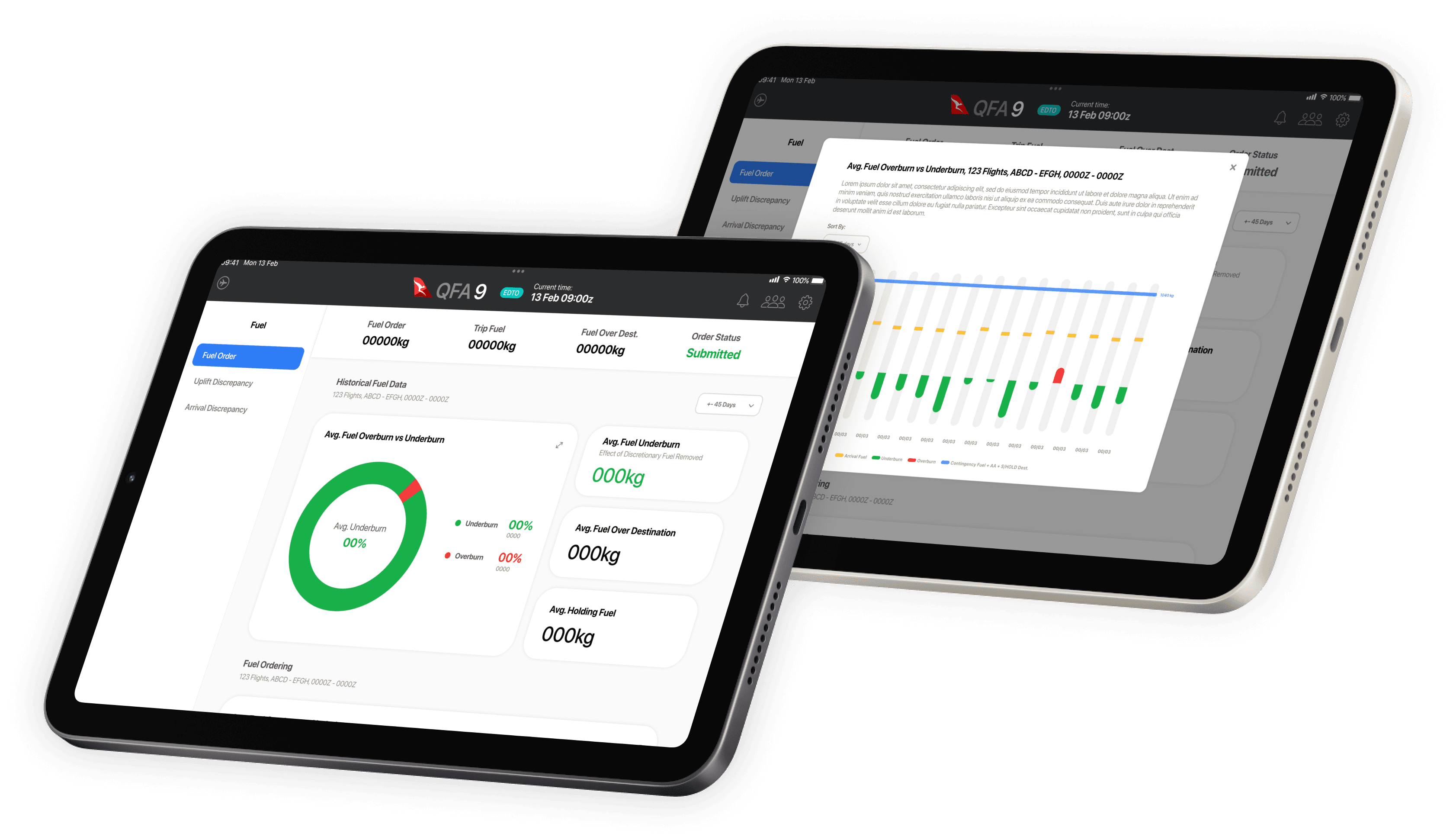
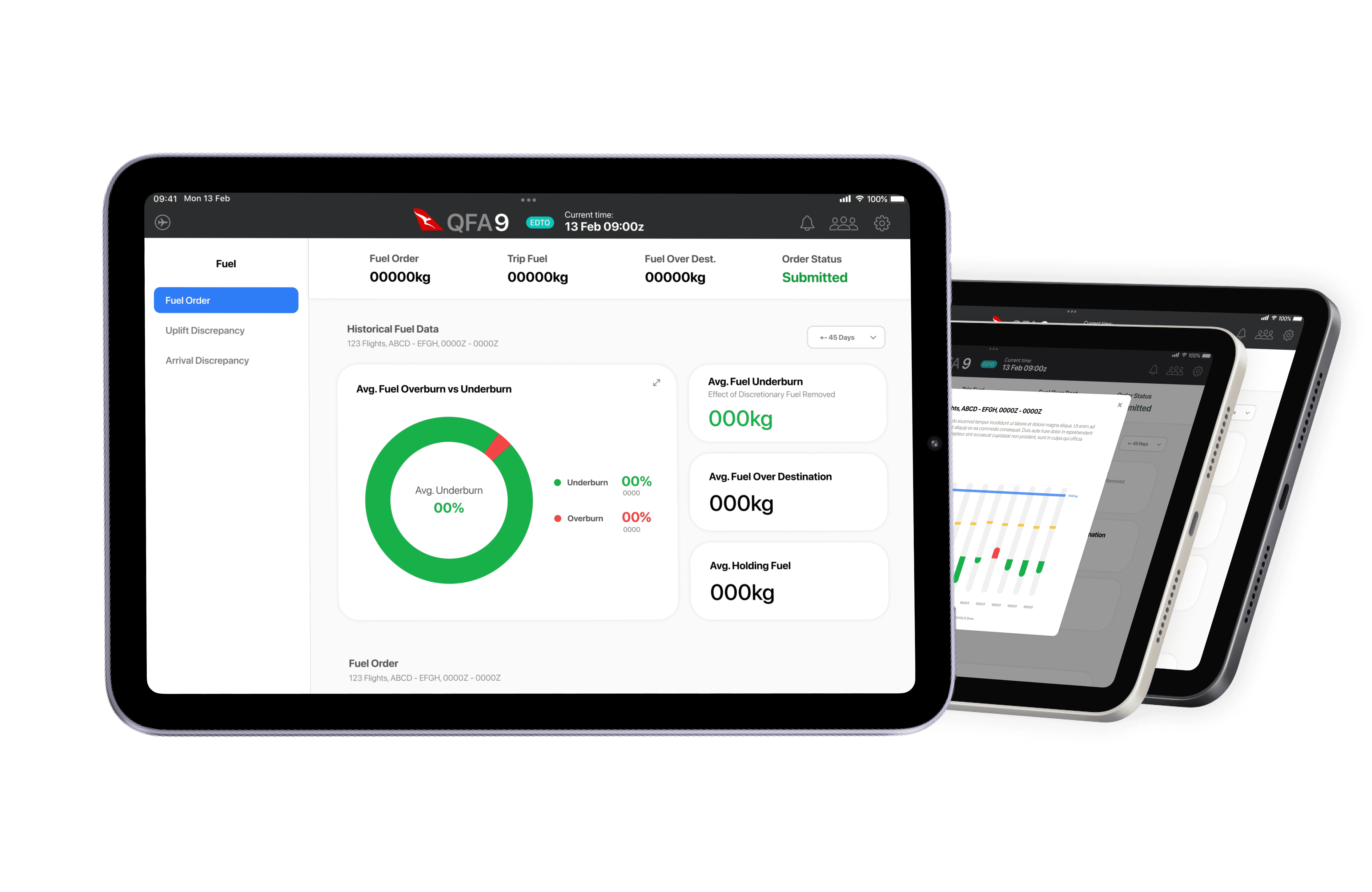
After several design iterations and collaborative sessions with the design manager and pilots, I redesigned the widget to prioritise 'glance-ability' and improve its ease of use. For visual coherency, inspiration was taken from Apple's design system as pilots would be familiar with iPadOS' user interface.
Fuel Data Widget
Recognising the high cognitive load pilots experience during flights, the goal was to simplify the display of complex data within the widget. This would enhance the efficiency and confidence of their fuel ordering process.
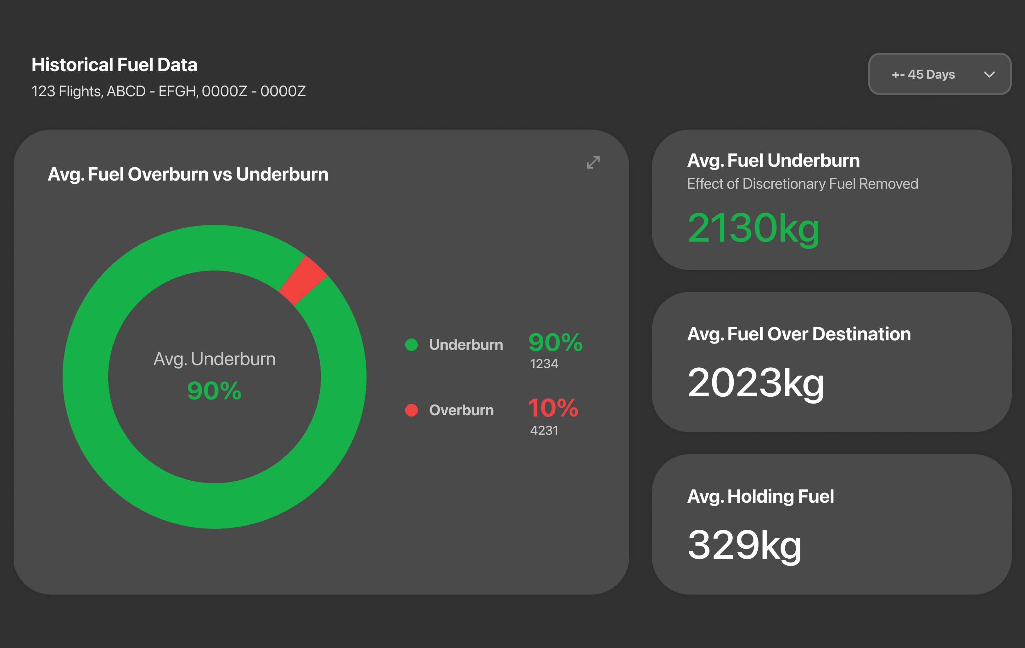

Expandable Graph
This widget enables pilots to further explore and sort through the historical data for their flight path with an expandable graph. The graph visually represents the arrival fuel, under-burn/over-burn of fuel, and planned the mandated contingency fuel.
Sticky Nav
This was added to provide pilots with quick access to key information within their fuel ordering process.

Reflection
A challenge that I came across in this project was understanding and empathising the workflow of pilots. Although I had somewhat of an understanding of the purpose of EFF+ going into this project, I still found it challenging to fully understand the whole fuel ordering process (I’m still in the process of fully understanding it!). The interviews helped a lot, with having pilots directly explain their workflow and how they progress through their fuel ordering process. Having experienced a jump seat also helped tremendously in gaining a better understanding.

Please reach out for an in-depth overview of the project’s design process
Say Hi 👋
EFF+ Fuel Ordering Redesign
Whilst undergoing an analyst rotation at the start of my graduate program, I actively sought out opportunities to flex and grow my UX design skills. This led me to a design manager who provided me the opportunity to work on an exciting re-design of a Qantas app called EFF+. Coming from someone who had little-to-no understanding of fuel ordering, working on this app re-design challenged me to gain a deep understanding of a pilot's complicated 'fly'-flow to address their everyday pain-points.
With time constraints due to the nature of the graduate rotation, I was responsible for re-designing the Historical Fuel Widget, which is essential part for the pilot's workflow is determining how much fuel to order for their specific flight plan.
Time
Early 2023
Duration
3 months
Role
Product Design
Team
Product Manager
UX Design Manager
Developers
Skills
User Research
Data Synthesis
Visual Design
The Result
After several design iterations and collaborative sessions with the design manager and pilots, I redesigned the widget to prioritise 'glance-ability' and improve its ease of use. For visual coherency, inspiration was taken from Apple's design system as pilots would be familiar with iPadOS' user interface.
Fuel Data Widget
Recognising the high cognitive load pilots experience during flights, the goal was to simplify the display of complex data within the widget. This would enhance the efficiency and confidence of their fuel ordering process.
Expandable Graph
This widget enables pilots to further explore and sort through the historical data for their flight path with an expandable graph. The graph visually represents the arrival fuel, under-burn/over-burn of fuel, and planned the mandated contingency fuel.
Sticky Nav
This was added to provide pilots with quick access to key information within their fuel ordering process.
Reflection
A challenge that I came across in this project was understanding and empathising the workflow of pilots. Although I had somewhat of an understanding of the purpose of EFF+ going into this project, I still found it challenging to fully understand the whole fuel ordering process (I’m still in the process of fully understanding it!). The interviews helped a lot, with having pilots directly explain their workflow and how they progress through their fuel ordering process. Having experienced a jump seat also helped tremendously in gaining a better understanding.
Pilots experience friction with the usability of the EFF+ app. This causes disruption to their flight planning workflow, which could in-turn cause pilots to overestimate how much fuel they think they need for their flight, ultimately costing the business more money.
How might we design a tool that guides pilots seamlessly throughout their fuel planning process, enabling them to make the best data-driven decision for their flight.
Business Goal
An objective the business had was to streamline the ecosystem of apps in which EFF+ lived in. As all the apps had it's own design system, database and codebase, the redesign of this app was the first step into making the ecosystem more consistent and connected. This would in turn reduce stress amongst the tech crew, as well as drive efficiency within the pilot workflow.
Process
Current State Audit
Competitor Analysis
User Interviews (Pilots)
Module Mapping (Hierarchy)
Wireframe Testing
Prototype Testing
Deliverables
Wireframes
Mid-fidelity Mock ups
Visual Designs
EFF+ Fuel Ordering Redesign
Whilst undergoing an analyst rotation at the start of my graduate program, I actively sought out opportunities to flex and grow my UX design skills. This led me to a design manager who provided me the opportunity to work on an exciting re-design of a Qantas app called EFF+. Coming from someone who had little-to-no understanding of fuel ordering, working on this app re-design challenged me to gain a deep understanding of a pilot's complicated 'fly'-flow to address their everyday pain-points.
With time constraints due to the nature of the graduate rotation, I was responsible for re-designing the Historical Fuel Widget, which is essential part for the pilot's workflow is determining how much fuel to order for their specific flight plan.
Time
Early 2023
Duration
3 months
Role
Product Design
Team
Product Manager
UX Design Manager
Developers
Skills
User Research
Data Synthesis
Visual Design
Pilots experience friction with the usability of the EFF+ app. This causes disruption to their flight planning workflow, which could in-turn cause pilots to overestimate how much fuel they think they need for their flight, ultimately costing the business more money.
How might we design a tool that guides pilots seamlessly throughout their fuel planning process, enabling them to make the best data-driven decision for their flight.
Business Goal
An objective the business had was to streamline the ecosystem of apps in which EFF+ lived in. As all the apps had it's own design system, database and codebase, the redesign of this app was the first step into making the ecosystem more consistent and connected. This would in turn reduce stress amongst the tech crew, as well as drive efficiency within the pilot workflow.
Process
Current State Audit
Competitor Analysis
User Interviews (Pilots)
Module Mapping (Hierarchy)
Wireframe Testing
Prototype Testing
Deliverables
Wireframes
Mid-fidelity Mock ups
Visual Designs
The Result
After several design iterations and collaborative sessions with the design manager and pilots, I redesigned the widget to prioritise 'glance-ability' and improve its ease of use. For visual coherency, inspiration was taken from Apple's design system as pilots would be familiar with iPadOS' user interface.
Fuel Data Widget
Recognising the high cognitive load pilots experience during flights, the goal was to simplify the display of complex data within the widget. This would enhance the efficiency and confidence of their fuel ordering process.
Expandable Graph
This widget enables pilots to further explore and sort through the historical data for their flight path with an expandable graph. The graph visually represents the arrival fuel, under-burn/over-burn of fuel, and planned the mandated contingency fuel.
Sticky Nav
This was added to provide pilots with quick access to key information within their fuel ordering process.
Reflection
A challenge that I came across in this project was understanding and empathising the workflow of pilots. Although I had somewhat of an understanding of the purpose of EFF+ going into this project, I still found it challenging to fully understand the whole fuel ordering process (I’m still in the process of fully understanding it!). The interviews helped a lot, with having pilots directly explain their workflow and how they progress through their fuel ordering process. Having experienced a jump seat also helped tremendously in gaining a better understanding.